Tackling the growing gap of consumer doubt
Role
Product Designer
Tools
Figma, Minecraft
TEAM
+3 members
DURATION
13 weeks
CONTEXT
City2Sea is an interactive platform that ….
The brief
Sensing the body in motion
My team was tasked to create an engaging and interactive user experience centered around the vague topic of 'Sensing the Body in Motion'. We set out to explore the realm of physical movement and delve into enhance sensory experiences.
There is only so much time in a day to fit everything.
In the rush of everyday life, maintaining an active lifestyle is easier said than done. It becomes inevitable to fall back to bad habits and sedentary behaviour. The design surrounded this idea — not a lack of desire to move but a lack of space for it. Objectives provided users these experience:
Objectives were to provide these experiences to users:
1
Flexible
Bring the appeal through convenience
2
Social
Associate movement with others to create enjoyment
3
Inclusive
Design it for everyone and for all activities
Problem space
Choosing a direction that was both simple, but bold.
My team began exploring recreational activities that blended physical movement with genuine enjoyment, either with others or solo.
Cardio wasn't just the safest option, it was the most innovative.
Being innovative also means to be inclusive because the best ideas are always the one that welcomes everyone regardless of age, gender, or background, no special equipment, no prior experience, no location, just a community coming together to embrace a universal form of movement and can seamlessly integrate into everyday life.
Background research
Through background research into the problem space, there was a realisation that sometimes all it takes is a nudge to get started.
We reviewed 11 papers and web sources to ground our design in evidence. Four themes rose to the surface.
🧘
Mental & Physical Benefits
Cardio has well-documented positive effects on wellbeing including the phenomenon of "runner's high" that drives long-term habit formation.
📊
Tracking Friction
Wearables and apps were inconsistently used so users cited forgetfulness and waning interest as the biggest barriers to sustained tracking.
👌
Convenience Wins
The ability to run anywhere, at any pace, on any schedule, was the most cited reason for choosing cardio over other forms of exercise.
🌳
Environment Matters
Novice runners were more sensitive to their surroundings; preferring green, safe spaces while experienced runners adapted more freely.
Problem Statement V1
"To investigate what truly motivates people to stick with cardio beyond health benefits and how thoughtful design can help turn it from a chore into a meaningful daily habit"
findings
Understanding what users wanted, their behaviours and usage patterns
To ensure the findings were well-rounded and reliable, my team triangulated the methods by combining survey data, interview insights, and online ethnography to leverage the strengths from each method and surface common themes.

These insights created a spark. My team looked back at Problem Statement V1 and asked why young adults specifically were struggling, and what was really standing in their way?
Problem Statement V2
"To investigate the motivating factors that encourages or hinders young adults to routinely incorporate cardio beyond it's health benefits, and how thoughtful design can help turn it from a chore into a meaningful daily habit"
"young adults" - narrow scope
Problem Statement V2 recognised the problem wasn't just 'how can we get them to incorporate activity into their lives?', but moreso, what was also pushing them away from it?
It was now clear: there were deeper and complex reasons behind user atittudes toward cardio. Reasons rooted not in laziness, but in the realities of everyday life.
analysis & synthesis
Having two options to choose from created a diverse range of insights to validate design decisions
As a precaution against bias, my team ran two analysis methods in parallel, allowing us to compare which approach surfaced the strongest and most reliable insights from our findings.


Four key insights emerged:
01
Trust
Consumers seek external guidance when purchasing skincare, but past disappointments have broken their trust making them hesistant to try new products
02
Value
The perceived value of skincare is tied to pricing and affordability. Cost shapes consumers' sense of quality and worth
01
Accountability
Consumers expect accountability from brands through stricter and visible regulation to foster trust to encourage them to purchase
02
Credibility
When buying skincare, consumers want credible sources. Not bold claims from brands or empty statement from influencers.
Synthesing through Visualing People Method
To visualise our audience, the synthesis mapped individuals across a 2D plane, plotting their motivations and lifestyles. Each persona was then built directly from our primary research, capturing the unique barriers and motivations of who we were designing for.

Meet Jordan, who has his needs and wants but can never find the time to fufill them

Jordan, 26
"I want to exercise after work, but by the time I get home I'm exhausted. I have too many responsibilities to juggle and not enough hours in the day"
By a time-poor young adult who just needs a reason to step outside, and something worth running towards
😟 Feels
Overwhelmed by work
Intimidated by 'gym-culture'
Guilty about unactiveness
⚠️ Challenges
Inconsistent work schedule
No one to exercise with
Doesn't know where to start
🎯 Wants
Flexibility and ease
Community without pressure
Interactive and fun
Ideation
Pitching wild ideas to turn into an out of the ordinary reality
Each team member developed a storyboard for their concept. We evaluated all three against a decision matrix, weighing feasibility, inclusivity, and user alignment.


magic interactive mirror


Harris Profile Decision Matrix
design consideration
It didn't need to build habits immediately. It just needed to spark them.
💡
As our problem statement focused on encouraging young adults to incorporate cardio as a habit, we recognised early on that our concept scored low against Key Criteria #4 — fostering maintainable habits. That was a setback worth sitting with.
key criteria #4 — fosters maintainable habits
While our concept didn't immediately foster habits, it sparked movement and brought entertainment into the experience. These became our building blocks.
When an experience is genuinely enjoyable and engaging, users come back — and repetition, over time, is what builds habit naturally (Salzberg, 2023).
low-fidelity
It was important to visualise where all the features and assets could come together coherently.
Utilising sketches allowed visualisation on the greater detail to showcase different themes and a closer view of the control panel
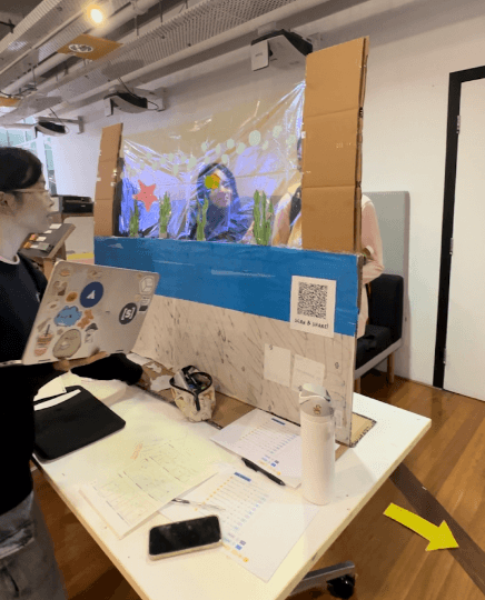
This is what City2Sea will look like in public
The installation is situated in areas where fitness is associated with such as parks or outdoor exercise zones. The tunnel features an LED screen that is generated based on movement with a QR code at the end that allows a fun and engaging video to be shared

Users needed to interact through the control panel
The panel at the beginning of the tunnel allows users to customise their output and what gets shown. For instance, if a user chooses to visualise breathing, the QR code video output will show planets floating

Themes to cater to different interests
The user can choose from various themes to generate content, catering to different interests. Each theme will have the same attributes but feature different objects. At this stage, we were deciding whether to allow users to select their theme or have it change daily to create variety.


MID FIDELITY
It was finally time to bring our inner Bob-The-Builder out.
Preparation Phase
🎯
Goal
For users to interact with the installation whenever approached, targeting energetic and young users who engage with their surroundings and are receptive to seeking cardio in their routine
Building Phase
Constructions were made to display all the features and assets to test on:
Features/assets
Control Panel
Buttons
Sharing feature
Digital handout
Installation
Walk through tunnel
construction
Responsive and functional
Created wire spirals and glued it onto 3D squares
Utility
QR code to share engages beyond the physical space
Immersive
Created sea animal assets with double sided tape to a reattach anytime a user walks through


Physical prototype
Share generated image with friends


View date, location, and next theme

DIGITAL PROTOTYPE

💡
Due to transportation and material constraints, we were only able to construct one side and at a smaller scale than we had hoped for. However, we narrated its complete physical shape to users during the testing phase for it to not hinder its usability
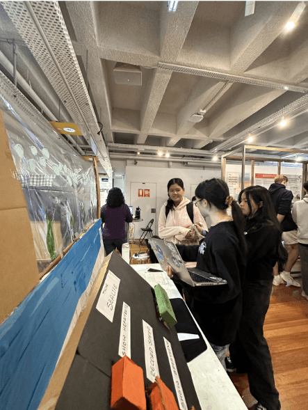
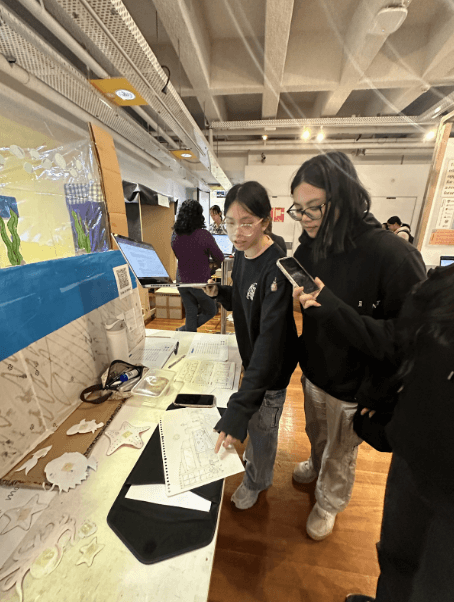
User testing
The feedback was relentless. But every negative response became motivation, not a setback, but a stepping stone to a better design


User feedback
8
Participants
79.6
System Usability Score out of 100
3
Testing methods - Think Aloud, Interview, SUS
Feedback
Excessive components
Redundant use of component
Text-heavy screens
Too much text made users feel overwhelmed
Icon confusion
Some users were unsure about the meaning of certain icons
No ingredient breakdown
They wanted to understand what was actually in their skincare, not just receive a recommendation
Privacy concerns
Users felt unsafe about the idea of completing a facial scan and where their data would be stored
Iterations
Simplified UI
Focused on creating a cleaner and more focused experience
Removed large chunks of text
Replaced with concise labels to reduce cognitive load
Replacement
Remove ambiguous icons with globally recognised icons to ensure users can complete every step
Replacement
An ingredient breakdown was added to each product, explaining what every key ingredient does
Additional page
Including a privacy disclaimer within the onboarding process to explain data storage, hoping to ease tension
Iterations
Several changes were made based on the feedback to ensure that the design better aligned with target user needs and expectations
Feedback
Iterations
App
Sharing app feature was no justifiable enough to be an extra step that users needed
Remove digital sharing function and QR code
Simplify user experience and reduce unnecessary steps. This change allowed for a streamlined interaction focusing on the core features without complexity
App
Sharing app feature was no justifiable enough to be an extra step that users needed
Remove digital sharing function and QR code
Simplify user experience and reduce unnecessary steps. This change allowed for a streamlined interaction focusing on the core features without complexity
Text-heavy screens
Too much text made users feel overwhelmed
Icon confusion
Some users were unsure about the meaning of certain icons
No ingredient breakdown
They wanted to understand what was actually in their skincare, not just receive a recommendation
Privacy concerns
Users felt unsafe about the idea of completing a facial scan and where their data would be stored
Iterations
Removed large chunks of text
Replaced with concise labels to reduce cognitive load
Replacement
Remove ambiguous icons with globally recognised icons to ensure users can complete every step
Replacement
An ingredient breakdown was added to each product, explaining what every key ingredient does
Additional page
Including a privacy disclaimer within the onboarding process to explain data storage, hoping to ease tension
Roapmap
What comes after all this?
Revenue stream, pricing strategies, business model
